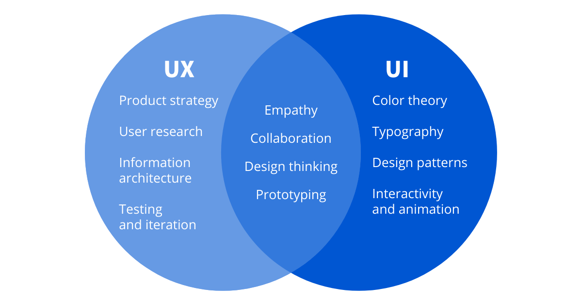
You can build the most powerful features in the world, but if users struggle to understand, trust, or enjoy your product, those features may as well not exist. I’ve seen this pattern repeatedly with startups and SaaS products: strong engineering, impressive roadmaps, and ambitious visions — all undermined by weak UI UX design.
Table of Contents
- The Hard Truth: Why Great Features Fail Without UI UX
- Website UI UX Is a Business Asset, Not a Design Detail
- Conversion Loss: Where Bad UI UX Quietly Kills Growth
- Founder & Product Team Mistakes I See Repeatedly
- What High-Performing Website UI UX Actually Looks Like
- Final Takeaway: Build Features, But Design for Humans
In today’s market, users don’t learn products anymore. They judge them. Quickly. Often in seconds. And that judgment is driven almost entirely by website UI UX, not feature depth.
The Hard Truth: Why Great Features Fail Without UI UX
From a user’s perspective, your product is not your architecture, your APIs, or your roadmap. It’s what they see, click, and feel.
If the experience is confusing or visually overwhelming, users don’t assume the product is powerful — they assume it’s broken, immature, or risky.
- First impressions matter: New visitors decide trust in seconds
- Trial users drop fast: Confusing onboarding kills adoption
- Buyers compare instantly: UX gaps are obvious side by side
Website UI UX Is a Business Asset, Not a Design Detail
Many founders treat UI UX as a finishing layer. Something to polish once the real work is done. That mindset is expensive.
- Higher conversions: Clear UX removes hesitation
- Better retention: Users return when things feel easy
- Sales trust: Polished UX signals maturity
Conversion Loss: Where Bad UI UX Quietly Kills Growth
Most conversion loss doesn’t come from one dramatic failure. It comes from dozens of small UX problems stacking up.
- Landing pages that explain features but not value
- Sign-up flows that ask too much too early
- Dashboards that overwhelm instead of guide
- Inconsistent buttons and interactions
Founder & Product Team Mistakes I See Repeatedly
Even strong teams fall into predictable UI UX traps.
- Designing for internal logic, not user logic
- Confusing clean visuals with usable design
- Shipping features faster than validating experience
- Letting opinions override user behavior
What High-Performing Website UI UX Actually Looks Like
Great UI UX is rarely flashy. It’s focused, predictable, and purpose-driven.
- Clear hierarchy: Users know where to look first
- Focused screens: One primary action per view
- Human language: Labels users understand
Final Takeaway: Build Features, But Design for Humans
UI UX design isn’t about looks. It’s about removing friction between intent and outcome.
If users hesitate, drop off, or disengage, the problem is often UX — not missing features. Design for humans first. Growth usually follows.
Frequently Asked Questions
Web Development
Custom website design and development using modern frameworks and responsive design.


